

Kitchen Design 101: Why Choosing the Correct Color for Your Kitchen Matters
Color is not just about beauty. It’s a powerful communicator that evokes emotions and memories and tells stories. This is especially true in the kitchen, the heart of our homes.
For many people, the kitchen is more than just a place to cook or eat. It’s a haven of smells, fragrances, and memories, where the family gathers for meals and stories. Such a significant space warrants careful planning, and color plays a crucial role in determining its atmosphere and functionality. Think about it: Have you ever stepped into a kitchen and instantly felt warm and welcomed by its sunny yellow walls? Or did you feel the cool, modern vibe of a kitchen dominated by clean grays and blues?
But, the impact of color stretches far beyond just setting the mood. It can also have an impact on how we perceive space. A well-chosen palette can make a compact kitchen feel spacious or give a large kitchen a cozier ambience. Moreover, the right colors can improve functionality by guiding our eyes and movements through tasks and making cooking more intuitive.
The Psychology Behind Color
Emotions Evoked by Different Colors
Colors have the intrinsic ability to elicit emotions, feelings, and memories. This association between color and emotion has both cultural and personal origins. Let’s look at how this manifests itself in our kitchens.
Warm v/s Cool Colors – Effect on Mood and Energy: Warm colors like reds, oranges, and yellows elicit feelings of warmth, comfort, and energy. A kitchen with these colors typically feels vibrant, lively, and inviting, encouraging family gatherings and animated conversations. On the other hand, cool hues like blues, greens, and purples are generally associated with serenity, tranquility, and freshness. They can transform your kitchen into a serene haven where you can unwind and relax after a long day.
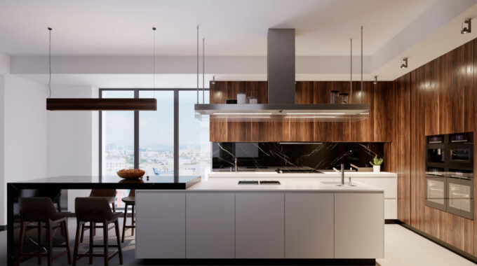
Neutrals and their Calming Presence: Neutrals like white, beige, gray, and taupe are usually considered safe options – but they do pack a punch of their own. Much like a blank canvas, these colors are adaptable and timeless. They add a sense of calm and stability to a place. A neutral kitchen can feel like a peaceful retreat, blending seamlessly with various décor components and inspiring a sense of equilibrium.
Color and Perception of Space
Colors affect not just our mood but also our perception of space. The shades you pick can either expand a room’s appearance or make it feel constricted.
How Light Colors Can Make a Space Look Larger: Light and pale colors reflect light, making a place feel open and airy while enhancing the effect of natural light. A light color palette can be a game-changer in small kitchens. Creams, pastels, and soft colors can cause the walls to recede, creating the illusion of a larger room. By incorporating these hues into cabinetry, counters, and walls, you can turn a small area into one that feels expansive and welcoming.
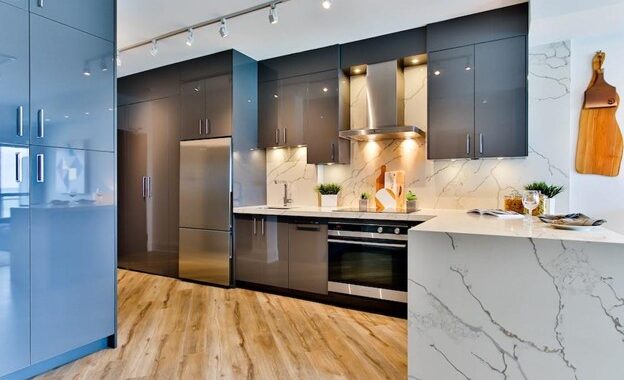
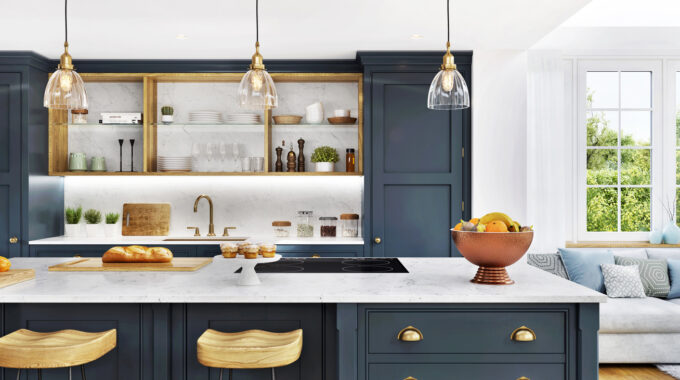
Dark Colors and the Feel of Intimacy and Coziness: Contrary to common belief, dark colors are not an automatic no-go for kitchens. When used strategically, deep blues, charcoals, and even blacks can lend a kitchen a luxurious and intimate feel. They can define and cozy up large rooms, creating a sense of encompassing warmth. The key, though, is balance. Combining dark colors with complimentary brighter hues and proper lighting can result in a classy and well-defined kitchen space.
Factors to Consider before Choosing your Kitchen Color
Size and Lighting
The size of your kitchen, paired with its lighting—both natural and artificial—plays a decisive role in choosing the right color palette.
Light Distribution in Smaller v/s Larger Kitchens: In a small kitchen, the choice of color can significantly define the perception of space. Lighter hues can make a room appear larger by reflecting more light and illuminating every nook and cranny. Larger kitchens, on the other hand, have a more flexible color palette since they can naturally accommodate a larger variety of hues without making the space feel cramped.
Reflection and Absorption Properties of Color: It is crucial to understand how colors behave under different lighting conditions. Light colors reflect light, making a room feel expansive and spacious, whereas dark colors absorb light, creating a cozier, more intimate atmosphere. Therefore, a kitchen with limited natural light could benefit from choosing a lighter color, whereas a well-lit kitchen can experiment with darker tints.
Existing Décor and Personal Style
Your kitchen doesn’t stand alone; it’s a part of a larger canvas, which is your home. It’s essential that its design resonates with the broader theme.
Harmonizing with Existing Fixtures and Furnishings: If you have a traditional wooden dining set or a rustic chandelier that you cherish, make sure the color of your kitchen complements these elements. It’s all about creating a unified appearance in which each piece feels like a part of a larger, cohesive story.
Personal Preferences and Lifestyle: At the end of the day, your kitchen should reflect your personality. If you love a burst of energy, a brilliant color like orange or red may appeal to you. On the other hand, if you prefer a calm and relaxing atmosphere in your kitchen, you may want to choose cool colors, such as blues or greens. These colors can help create a sense of peace and make the space feel larger and more spacious.
Maintenance and Longevity
While aesthetics are important, functionality should never be disregarded. The colors you chose should not only look attractive but also stand the test of time.
The durability of Lighter v/s Darker Shades: Lighter hues, while opening up space, may show stains or discolorations more easily than darker colors. On the other hand, darker tints, particularly in high-traffic areas, are more susceptible to showing wear and scratches.
Stains, Smudges, and Wear: Kitchens are bustling spaces, prone to spills, splatters, and smudges. Consider the ease of cleaning and maintenance when selecting a color, particularly for countertops, backsplashes, and walls near the cooking area. Some colors may conceal discoloration better than others, while others may require frequent touch-ups.
Popular Kitchen Color Trends and Their Impact
The Timeless Appeal of Neutrals
The kitchen design world may be ever-evolving, but the allure of neutrals remains constant and timeless.
White, Beiges, and Grays – Versatility and Elegance: These colors have long been popular due to their versatility and timeless appeal. White, for example, evokes a sense of cleanliness and purity, making it a popular choice for kitchen decor. Beiges and grays, meanwhile, are unsung heroes, creating a muted elegance that works with practically every design style, from modern to rustic.
Pairing Neutrals with Bold Accents: While neutrals are beautiful on their own, they also serve as a blank canvas for brighter accents. Whether it’s a vibrant backsplash, colorful appliances, or striking cabinetry, neutrals offset and emphasize these design elements beautifully, allowing them to stand out.
Bold and Vibrant Hues
There’s no denying that color can make a statement, and recent trends see kitchens embracing bolder shades with open arms.
Statement-Making Colors and Their Influences: From vibrant reds to deep purples, these colors are all about making a statement. A ruby-red island or turquoise cabinets can become the focal point of the room, infusing it with vitality and personality. These choices often reflect the homeowner’s personality, demonstrating their willingness to take design risks and affinity for the unusual.
Balancing Bold Choices with Natural Elements: As powerful as these colors are, balance cannot be overlooked. It is vital to keep the vibrancy from overpowering. Using neutral components, such as a gray backsplash with a lemon-yellow wall or white counters with deep blue cabinets, promotes harmony and keeps the area from appearing cluttered.
Natural and Earthy Tones
There’s a growing inclination towards bringing the outdoors in, and kitchens are no exception.
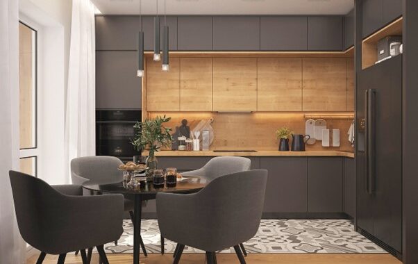
Greens, Browns, and Blues: A Connection to Nature: These colors evoke the tranquility of nature. Greens, whether olive or mint, complement the lushness of the foliage. Browns, from tan to deeper chocolate, evoke the earthiness of soil and wood. And blues, particularly the subdued and pastel kind, reflect the serenity of skies and water.
Creating a Serene and Grounded Kitchen Atmosphere: A kitchen bathed in these colors feels like a haven – a place of tranquility amid the turmoil of everyday life. It is not just about the visual appeal but also how certain colors make one feel. In an increasingly urban and disconnected society, an earth-toned kitchen can serve as a daily touch-point to nature, grounding us and bringing solace.
Tips and Tricks for a Balanced Color Palette
The 30-60-10 Rule
The 60-30-10 rule, a classic principle in interior design, provides a harmonious way to use colors in any room, including the kitchen.
Dominant, Secondary, and Accent Colors: Achieving Harmony: According to the rule, a dominant color should be used for 60% of the room, which commonly includes walls and large spaces. The secondary color should cover 30% of the surface area of mid-sized features such as cabinetry or an island. The remaining 10% is for accents like backsplashes, minor appliances, or kitchen decor. This division promotes a balanced color distribution, keeping any color from becoming overpowering.
Integrating Patterns and Textures:
A kitchen’s aesthetic value stems not just from its color palette but also from how its patterns and textures interact.
Combining Colors through Backsplashes, Countertops, and Fixtures: Patterns, whether complex or simple, add a dynamic aspect to the kitchen. For example, a patterned backsplash might incorporate different shades in a unified design, bridging the gap between your dominant and accent colors.
The Play of Light on Different Surfaces: Light can drastically change the appearance of a color, particularly when it interacts with various textures. Even if they are the same color, a matte-finished wall, a glossy countertop, and a tiled backsplash will display varying hues due to their texture. Using this to your advantage can help you add depth and interest to your kitchen palette.
Transitioning Colors – From Walls to Cabinets
As the heart of the home, the kitchen should evoke a sense of flow and cohesion in its design, and transitioning colors play a pivotal role in achieving this.
Creating Flow and Cohesion in the Kitchen Design: The key is to make sure that colors, while unique, have a harmonic relationship. For example, if your walls are soft beige, shifting to deep brown cabinets would be more seamless than going straight to black. This ensures that the colors flow into one another rather than changing abruptly.
Strategic Placement of Color Transitions: The transition should not be visually jarring. A common strategy is to maintain adjacent surfaces in similar or complementary hues. For instance, if you have a vibrant blue wall, consider introducing the transition in the form of a patterned backsplash before diving into neutral cabinets. This eases the color transition and makes it visually pleasing.
Wrapping Up
Choosing the proper color palette for your kitchen goes beyond aesthetics. It is about creating a setting that elicits emotions, improves functionality, and reflects one’s unique style. Colors, in their subtle ways, can define the ambience of a space and how it makes us feel.
This guide looked into the intricacies of kitchen colors, making it clear the ways in which smart choices can greatly enhance the heart of your room. With a thoughtful, understanding, and creative approach, your kitchen can become a place that is not only visually appealing but also emotionally fulfilling.
Here’s to designing kitchens that aren’t just places for cooking but also canvases for personal expression. Contact Modern Kitchen Center in Glenwood Springs today and let us help with your kitchen design!

Related Posts
Unlock the Magic of Kitchen Cabinetry: 17 Stylish and Functional Ideas to Transform the Heart of Your Home
The kitchen, often considered the heart of the home, is a space where style meets…
The Importance of Color Psychology in Kitchen Design
Imagine walking into a room painted in a vibrant shade of orange. How does it…
20 Must-Have Designs to Turn Your Kitchen into a Chef’s Paradise
The kitchen is more than a space to prepare meals; it's a culinary haven where…